
Date Range Selection
Users were having major issues with the calendar system and how the comparison of date ranges worked. There were two separate buttons for the date ranges: the selected date range and the comparison date range. Clicking on either of them opened a separate calendar view. In the popup, there were two calendars: one for the start date and one for the end date. This was a mess to use.
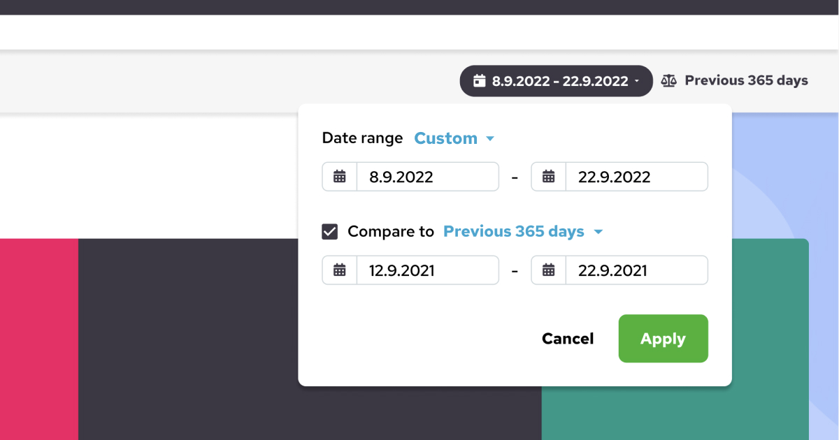
The Solution
I visually separated the selected date range and the date range it was compared against. I took the template comparison date range options and expressed them with words next to the selected date range. If a custom date range was used, it was then shown with absolute values. I also removed the two side-by-side calendars from the popup entirely and used one calendar for selecting the start and end dates. I also made the comparison calendar optional with a checkbox.
Users were pleased with the end result, and according to testing, they understood the concept very well, thus improvement was being made.